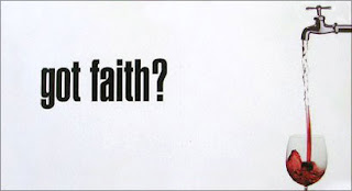
Most billboards have too many words and are therefore incredibly hard to read when passing by at high speeds in a car, or they have pictures that over power the wording making it difficult to read again. Contrary to my usual perceptions the “Got Faith” Billboard was easy to read and very clear. The simple white background with the bold black lettering is a copy of the “Got Milk” campaign. This makes it easier to decipher because our brains are more familiar with the visual and slogan. The simple visual added to the billboard appeal as well. It displayed the miracle at Cana when Jesus turned water into wine but it did so in a modern fashion. It made religion and the bible come into the 21st century and it was able to catch my attention when I was driving by.
I really liked this billboard because it was so simple. Its’ solid white background made it stand out against the trees it was in front of, but it was not an eyesore to the area. It had a very basic concept, to make people think about God and religion, and it did exactly that. The “Got Faith” billboard was not forcing religion on anyone, it was just bringing up the topic and it did so by using one of the most well know bible stories and common phrases. It was very well crafted and appealed to a broad audience.

No comments:
Post a Comment